You have almost certainly been manipulated by a dark pattern today. You just did not notice. That is not a failure of your intelligence. It is a feature of the design.
Dark patterns are interface choices engineered to make you do something you would not do if the options were presented honestly. Buy something you did not need. Sign up for something you did not want. Stay subscribed to something you forgot you had. They are not accidents. They are not lazy design. They are deliberate, tested, and optimised.
The most effective manipulation does not feel like manipulation. It feels like a choice you made freely. That is the whole point.
Where the Term Came From
The phrase was coined in 2010 by Harry Brignull, a UX designer with a PhD in cognitive science. He had spent years watching companies use interface design not to help users, but to exploit them. He started a website, originally called darkpatterns.org, to name and shame the worst offenders. The term stuck. Fifteen years later, the European Union is writing laws to ban them.
That tells you something important. This was never an edge case. It was always a business model.
The Five You Will Recognise
There are dozens of named dark patterns, but most fall into a handful of categories. Here are the five you have almost certainly encountered.
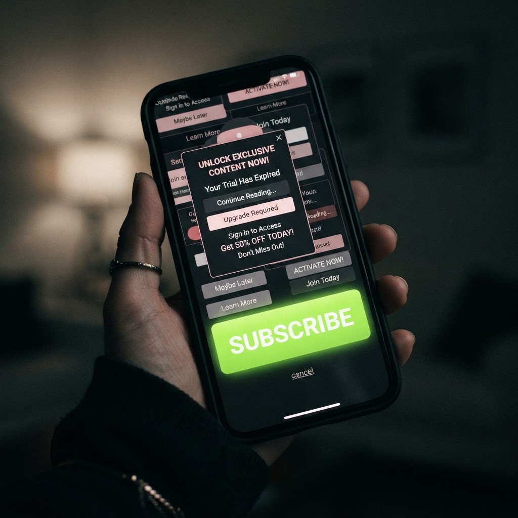
1. The Roach Motel. Easy to get in, nearly impossible to get out. You sign up for a free trial with two clicks. To cancel, you need to navigate four pages, confirm three times, receive an email, click a link, scroll past an offer, and then maybe, if you are lucky, find a tiny grey button at the bottom of the screen. A 2024 study from the University of Chicago found over thirty distinct dark patterns used in subscription cancellation flows alone. The design is not helping you cancel. It is wearing you down.
2. Confirmshaming. When you are given the option to decline something, the decline button is written to make you feel stupid or cheap. "No thanks, I prefer to pay full price." "No thanks, I do not want to save money." The option is technically there. The language is designed to make sure you do not click it.
3. Forced Continuity. You give your card details for a free trial. The trial ends. You are automatically charged. No reminder email. No warning screen. The transition from free to paid is designed to be invisible. According to the Better Business Bureau, customers lost an average of $140 each to subscription traps, with over 58,000 complaints filed in the US alone. In Canada, the figure was even starker: more than 50,000 complaints and $1.4 billion in losses.
4. Sneak into Basket. You are buying one thing. By the time you reach checkout, there are three things in your cart. Insurance you did not ask for. A subscription you did not select. An add-on that was pre-checked and buried in the fine print. You only notice if you scroll back up and read every line. Most people do not.
5. Nagging. The app asks you to turn on notifications. You say no. It asks again the next day. And the next. And the next. Each time, the "allow" button is large and bright. The "not now" option is small and grey. Instagram is notorious for this. The design is not respecting your choice. It is waiting for your willpower to crack.
Why They Work So Well
Dark patterns work because they exploit cognitive shortcuts that all humans use. We scan rather than read. We assume defaults are recommendations. We feel social pressure from language. We avoid effort. None of these are weaknesses. They are how the brain manages a world of infinite choices with limited attention.
The problem is not that humans are lazy. The problem is that companies have teams of designers, researchers, and data scientists whose entire job is to understand these shortcuts and build interfaces that exploit them. You are not making a bad decision in a fair environment. You are making a perfectly rational decision in an environment that was engineered to produce a specific outcome.
When you signed up for that subscription you forgot about, you were not being careless. You were being played. There is a difference, and it matters.
Research from the OECD identified six common dark patterns in online shopping alone, from fake countdown timers to fabricated low-stock warnings. A 2023 study published in the Journal of Consumer Research found that four specific dark patterns, including low-stock messages and urgency timers, significantly influenced which products people chose. These are not hypothetical concerns. They are documented, measurable effects on real purchasing behaviour.
The EU Is Catching Up
In March 2025, the European Commission published detailed guidelines for eliminating dark patterns in online stores. The EU's Digital Fairness Act has since moved from aspiration to timetable: the Commission's Digital Fitness Check concluded that existing consumer law is inadequate to stop manipulative design, and the proposal—with broad prohibitions on dark patterns, addictive design, and behavioural manipulation—is expected in the second half of 2026, with the rules unlikely to apply before 2027 or 2028. The framework is not perfect. Critics argue it is fragmented, with no unified legal definition across member states. But the direction of travel is clear: the EU has decided that deliberate manipulation through interface design is a consumer protection issue, not just a design choice.
The UK has been slower. Ofcom has addressed some dark patterns in its Online Safety work, but there is no comprehensive ban equivalent to what the EU is proposing. That gap matters. It means UK consumers are currently less protected than their European neighbours from the same manipulative tactics.
What You Can Actually Do
You cannot redesign the apps. But you can change how you move through them.
Slow down at checkout. Before you tap buy, scroll back through your cart and check for anything you did not add yourself. If a subscription requires your card for a free trial, set a calendar reminder for the day before it expires. When an app asks you to enable notifications for the fifth time, notice the pattern. The nagging itself is information.
And when you see a bright green button and a tiny grey link, ask yourself which one the company wants you to click. Then ask yourself why.
The most important thing to understand is this: dark patterns are not a bug. They are not the result of a careless designer who forgot to make the cancel button visible. They are the product. Every confusing checkout, every hidden subscription, every guilt-tripping decline button exists because someone tested it, measured the results, and decided it was worth keeping. The manipulation is the feature. Your frustration is the revenue model.
Once you see them, you cannot unsee them. And that is the beginning of protecting yourself from them.